
Data and Sources
Every number on Death Clock Calculator comes from public data and published studies. This data and sources page lists each dataset we use, the exact release and year, and every study behind the calculator. You can also download our country life expectancy data as a free CSV file.
- UN 2024 data, 201 countries
- Nothing stored or sent
- Free, no sign-up
On this page
Download the country data (CSV)
Life expectancy at birth for men and women in 201 countries and territories, with source and data year for every row. Free to use with credit.
Please credit: “United Nations, World Population Prospects 2024, via death-clock-calculator.online”. The underlying UN data is published under a Creative Commons licence (CC BY 3.0 IGO).
Data and sources: which datasets do we use?
| Dataset | Publisher | Release and year | Used for |
|---|---|---|---|
| World Population Prospects | United Nations, DESA Population Division | 2024 revision, medium variant, estimates for 2023 | Life expectancy at birth for all 201 countries and territories; world and regional figures |
| World Population Prospects | United Nations | 2024 revision, projection for 2026 | World deaths and births for the world death clock |
| Global Health Estimates | World Health Organization | 2021 estimates (published 2024) | Causes of death by country, age and sex |
| National life tables | US NCHS, UK ONS, Statistics Canada, Australian Bureau of Statistics | Latest release for each | National comparison figures on country pages |
Data and sources: which studies are behind the calculator?
| Input | Study | Key finding we use |
|---|---|---|
| BMI | Global BMI Mortality Collaboration, The Lancet, 2016 | Hazard ratios by BMI band; lowest risk at 20 to 25 |
| Smoking | Doll and Peto, BMJ, 2004 | About 10 years lost; 10, 9, 6 and 3 years won back by quitting at 30, 40, 50 and 60 |
| Alcohol | GBD 2016 Alcohol Collaborators, The Lancet, 2018 | Lowest overall harm at zero drinks |
| Activity | Moore and colleagues, PLOS Medicine, 2012 | Up to 4.5 extra years for the most active |
| Diet | PREDIMED, NEJM, 2018; Fadnes and colleagues, PLOS Medicine, 2022 | Fewer heart events; years gained from better diets |
| Outlook | Lee and colleagues, PNAS, 2019; Alimujiang and colleagues, JAMA Network Open, 2019 | Optimism and purpose linked to lower death rates |
| Model | Gompertz, 1825; Makeham, 1860 | The survival formula |
Full references with links are on how we calculate.
How often is the data updated?
We check for new releases at least every six months. When the UN publishes a new World Population Prospects or WHO publishes new Global Health Estimates, we update within a month and note the change in our change log. See our editorial policy.
Why UN data and not national figures?
The UN uses one method for every country, so figures can be compared fairly. National statistics offices often publish newer years, and we show those next to the UN figure on our country pages, for example life expectancy in the United States.
Can I use your data or charts?
Yes. You may use the CSV and our charts with a link back to this page. Please don’t present our model estimates as official statistics. They are educational estimates built on official data.
What is inside the CSV file?
The main download on this data and sources page is a plain text file with one row per country or territory. It opens in any spreadsheet program. Each row has the same eight columns:
| Column | What it holds | Example (United States) |
|---|---|---|
| ISO3 | The standard three-letter country code | USA |
| Country | Country or territory name | United States |
| Male life expectancy at birth | Years, men | 76.86 |
| Female life expectancy at birth | Years, women | 81.85 |
| Male life expectancy at 65 | Average years left for men who reach 65 | 18.67 |
| Female life expectancy at 65 | Average years left for women who reach 65 | 21.22 |
| Source | Dataset, release and variant | UN World Population Prospects 2024 (medium variant, estimates) |
| Data year | The year the figures describe | 2023 |
The two columns at age 65 are useful if you are thinking about retirement. They show that people who reach 65 usually live well into their 80s in many countries.
How to use our data and sources in a spreadsheet
- Download the file using the button near the top of this page.
- Open it in Excel, Google Sheets, LibreOffice or Numbers. It uses commas between values and a header row.
- Sort or filter by any column, for example to rank countries by female life expectancy.
- Add your own columns, such as the gap between men and women.
- Credit the source in anything you publish, using the wording shown near the top of this data and sources page.
Names with accents, such as Côte d’Ivoire and Réunion, are saved in UTF-8. If they look odd, choose UTF-8 when you import the file.
What the data and sources show at a glance
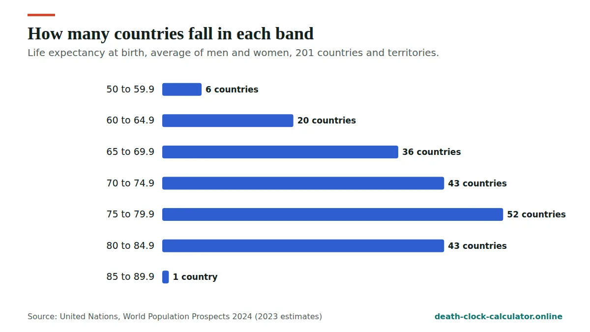
Here are a few things you can see quickly in the CSV from this data and sources page. All are our working from UN World Population Prospects 2024 (2023 estimates).
- Highest. Hong Kong has the highest life expectancy at birth for both men (82.8) and women (88.1).
- Lowest. Chad is lowest for men (53.2) and Nigeria for women (54.7).
- The gap between the sexes. Women live longer on average by 5.2 years across the 201 countries and territories. The widest gap is in Ukraine (13.3 years) and the narrowest in Togo (0.4 years).
- Where some large countries rank. Out of 201, the United States ranks 49th for men and 50th for women, and the United Kingdom 32nd and 39th.
- At age 65. Women in Hong Kong who reach 65 have about 25.2 years left on average. Men in Nigeria who reach 65 have about 12.0.
For the full ranked lists, see life expectancy by country.
How our data and sources become your estimate
The CSV is only the starting point of our data and sources. Here is how the death clock turns them into the estimate you see.
- Baseline. We take the UN life expectancy at birth and at 65 for your country and sex.
- Fit the curve. We fit a Gompertz-Makeham survival curve for each country and sex so that it matches both UN figures.
- Adjust for your age. The curve gives the average years left for people who have reached your age.
- Apply your habits. Optional answers change the death rate using hazard ratios from the published studies listed above.
- Show a range. The same curve gives the middle half of outcomes, not just a single age.
One number that comes out of the fit is the mortality doubling time: how many years it takes for the adult death rate to double. It differs quite a lot by place.
| Group | UN years left at 65 | Fitted doubling time (years) |
|---|---|---|
| United States, men | 18.67 | 8.7 |
| United Kingdom, women | 21.34 | 6.8 |
| Japan, women | 24.85 | 6.3 |
| Nigeria, men | 11.99 | 14.7 |
Every step, with the constants, is on how we calculate.
Official figures and model estimates
It matters to know which numbers on this site are official and which are ours. Our data and sources fall into two groups.
| Type of figure | Official or model? | Where it comes from |
|---|---|---|
| Life expectancy at birth and at 65 by country | Official | UN World Population Prospects 2024 |
| Causes of death by country | Official | WHO Global Health Estimates 2021 |
| Years left at your exact age | Model estimate | Our survival curve, fitted to UN figures |
| Change in years from a habit | Model estimate | Published hazard ratios, turned into years by our model |
| Chance of reaching 70, 80, 90 or 100 | Model estimate | Our survival curve |
| Projected death date and countdown | Model estimate | Your age plus the model’s years remaining |
If you quote a model estimate, please call it an estimate from Death Clock Calculator, not an official statistic.
How we check our data and sources
Every figure in our data and sources goes through the same simple checks before it appears on the site:
- One source per number. Each figure is traced back to a single named release and year.
- Match the download. Country figures on our pages come from the same CSV you can download, so they always agree.
- Compare with national tables. Where a national statistics office publishes its own life table, we compare, and show both on country pages.
- Log every change. When a release changes our numbers, we note it on the method page.
The full process behind our data and sources is set out in our editorial policy.
Limits of our data and sources
No dataset is perfect. Being open about the limits of our data and sources helps you judge the results fairly.
- They are period figures. They describe death rates in 2023, not how things will change over your life.
- They lag a little. National offices sometimes publish more recent years than the UN.
- Some countries have fewer records. Where death registration is incomplete, the UN has to estimate more, so figures carry more uncertainty.
- Averages hide differences. Within one country, life expectancy varies by region, income and many other things.
- Studies have limits too. The habit effects come from large published studies, and they may fit some groups of people less well than others.
These limits are one reason every result shows a range rather than a date. You can read more in is the death clock real?
Found a problem in our data and sources?
If a figure in our data and sources looks wrong, or a newer release is out, please tell us through our contact page. Include the page, the figure and the source you are comparing with. We check every report and correct confirmed errors quickly. Our data and sources are also listed with every other tool and guide on our death clock resources page.
How to cite our data and sources correctly
A good citation lets a reader find the same number you used. Name the publisher, the release, the data year and where you got the file. The UN is the source of the country figures in our data and sources file.
Here is an example citation you can adapt for a report, article or school project:
- Example: United Nations, World Population Prospects 2024 (medium variant, estimates for 2023). Life expectancy at birth, United States: men 76.86 years, women 81.85 years. Via death-clock-calculator.online, data and sources page.
If you quote one of our model figures instead, name it as ours. For example: “Death Clock Calculator estimate, for a healthy 40-year-old US man who never smoked: average age at death 79.1.” Keep the conditions in the sentence, because the figure changes if they change.
Comparing two countries fairly with the CSV
The CSV makes side by side comparisons easy, but a fair comparison needs a few simple habits. Follow these steps:
- Compare like with like. Men with men, women with women, and at birth with at birth.
- Look at both ages. A gap at birth can shrink a lot at 65, because it partly reflects deaths at younger ages.
- Check the source and year columns. Every row in our data and sources file uses the same release and year, so the rows can be compared directly.
| Comparison | Gap at birth (men / women) | Gap at 65 (men / women) |
|---|---|---|
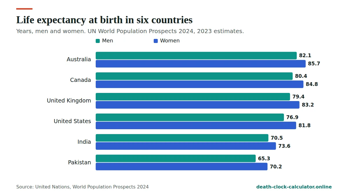
| United Kingdom minus United States | 2.5 / 1.4 years | 0.3 / 0.1 years |
| India minus Pakistan | 5.2 / 3.4 years | 1.9 / 1.4 years |
For UK and US men, a 2.5 year gap at birth shrinks to about 0.3 years at 65.
Common mistakes when reading life expectancy data
These are the errors we see most often when people quote figures from our data and sources:
- Treating the average as a limit. Life expectancy at birth of 76.86 for US men does not mean most men die at 76. Many live much longer.
- Adding years at 65 to birth figures. Life expectancy at 65 is years left from 65. A US man who reaches 65 has about 18.67 years left on average, so the average age is near 84, not 76 plus 18.
- Reading a period figure as a forecast. The numbers describe death rates in 2023, not the future.
- Mixing sources. National and UN figures can differ. Use one source for any comparison.
- Applying a group average to one person. No figure here can tell you when a particular person will die.
If a number leaves you uneasy, our death anxiety help page has calm, practical ideas. For the terms used above, see the life expectancy glossary.
Quick checklist before you publish
Before you share a chart or table built from our data and sources, run through this short list:
- Did you name the UN release and the 2023 data year?
- Are men and women shown separately, or clearly combined?
- Are our model estimates labelled as estimates, with their conditions?
- Did you avoid words like “will die at”, which suggest a prediction for a person?
To see how the data and sources turn into a personal estimate, try the death clock.
Frequently asked questions
Where does your life expectancy data come from?
Country figures come from the United Nations World Population Prospects 2024, estimates for 2023. Causes of death come from the WHO Global Health Estimates 2021. Lifestyle effects come from nine published studies listed on this page.
Can I download your data?
Yes. The CSV on this page has life expectancy at birth for men and women in 201 countries and territories, with source and year for every row.
How often do you update the data?
We check at least every six months and update within a month of any new UN or WHO release. Every change is logged on our how we calculate page.
What is the difference between life expectancy at birth and at 65 in the CSV?
Life expectancy at birth is the average length of life for a newborn at 2023 death rates. Life expectancy at 65 is the average number of years left for people who have already reached 65. Both columns come from UN World Population Prospects 2024 and are listed on this data and sources page.
Are your model estimates official statistics?
No. The country figures in the CSV are official UN estimates. Figures such as years left at your exact age, chances of reaching 90 and projected dates are model estimates from Death Clock Calculator. Our data and sources section explains which is which, so you can quote each one correctly.
Why don't your figures match my national statistics office?
National offices often publish a more recent year and use their own methods. The UN uses one method for every country so they can be compared fairly. Our country pages, such as life expectancy in the United Kingdom, show both figures side by side.
Can I cite your data and sources in a school or university project?
Yes. Cite the United Nations, World Population Prospects 2024, and mention that you downloaded it from this data and sources page. If you use our model figures, describe them as educational estimates. For the formula and constants, point readers to how we calculate.
Source links
- United Nations. World Population Prospects 2024. population.un.org/wpp
- World Health Organization. Global Health Estimates. who.int
- National Center for Health Statistics. Mortality in the United States, 2024. cdc.gov
- Office for National Statistics. National life tables, UK: 2022 to 2024. ons.gov.uk
See your own estimate in 30 seconds
Free, private and based on UN 2024 data for 201 countries. Nothing you enter is stored.
Open the death clock →